


Create. Design. Inspire
Crafting a homepage that moves both users and metrics.
THE CHALLENGE
Shutterstock needed more than a fresh coat of paint. The goal was clear: evolve the homepage to better represent the full breadth of Shutterstock’s creative tools and content and turn qualified visitors into paying customers.
As principal product designer, I led the design vision and execution, translating strategic business goals and research insights into a flexible, conversion-driven experience.
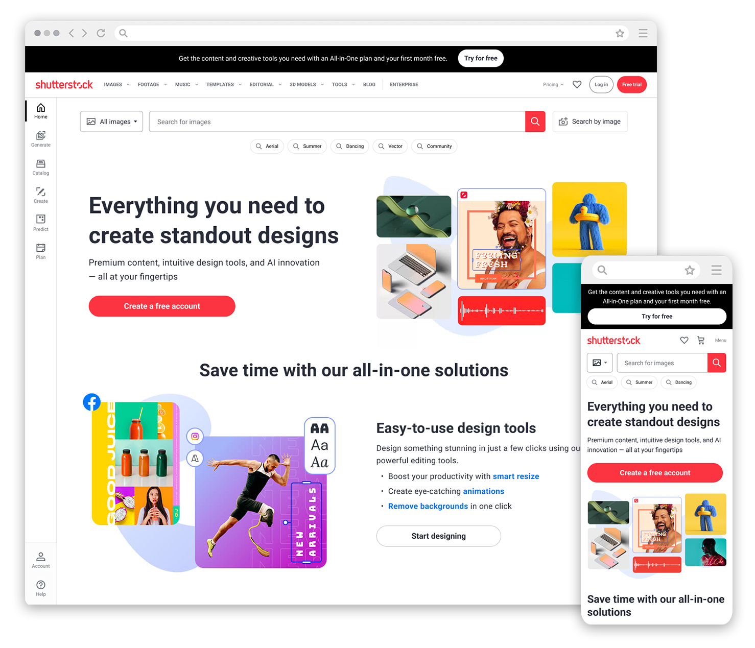
The old homepage emphasized search but failed to communicate Shutterstock’s full creative value. The new design builds momentum through structured storytelling, product discovery, and smarter navigation paths.
OUR HYPOTHESIS
We believed that introducing Shutterstock’s Creative Flow design tools directly in the homepage hero, alongside a strong free trial offer, would help attract more qualified traffic with higher intent to engage and convert.
In addition, creating a new homepage component specifically focused on showcasing the design tools would improve overall discoverability, helping users better understand the full creative potential Shutterstock offers beyond stock content.
COLLABORATIVE DISCOVERY
Working closely with our UX design researcher and marketing teams, we reviewed persona insights developed through JTBD methodology and brand tracker profiles.
Site behavior analysis revealed a clear pattern: most homepage engagement was concentrated on the search bar, with users largely missing the broader Shutterstock ecosystem. This opened up a major opportunity to redesign the homepage flow, create strategic entry points, and guide visitors toward more valuable interactions.
Real user needs and motivations, gathered through research and persona development, helped prioritize which offerings to feature and how to guide users toward higher-value actions.
Early user behavior analysis revealed a missed opportunity. With interactions heavily concentrated on the search bar, the homepage had to evolve to surface Shutterstock’s broader ecosystem earlier and more clearly.
COMPETITIVE INSIGHTS
Competitive research and Baymard* Institute best practices reinforced our findings. Leading platforms paired strong brand value propositions with clear offers and intuitive content structures. To compete, Shutterstock needed to strengthen its visual hierarchy, improve content organization, and connect its creative ecosystem directly to user needs.
*Baymard is an independent UX research institute. Shutterstock subscribed to their best practices, benchmarks, and design examples.
Competitive analysis confirmed that leading platforms paired strong value propositions with clear offers and structured content. To match and exceed user expectations, Shutterstock’s homepage needed a sharper hierarchy and a more strategic visual flow.
DESIGN APPROACH
Visually, we prioritized clarity, momentum, and discoverability:
Modernizing the Hero: We reimagined the hero section to immediately introduce Creative Flow tools with a bold free trial CTA, capturing user attention at first scroll.
Building Flexible Modules: New homepage sections surfaced Shutterstock’s evolving offerings, designed for easy updates and scalability as the brand continues to grow.
Testing and Iterating: Throughout the process, we conducted design experiments on layout variations, content density, and CTA placement to optimize for engagement and conversion.
WIREFRAMING
We built quick wireframes to focus on content hierarchy and messaging structure without getting distracted by visuals. Using high-performing copy from PMMs, we positioned the full brand value proposition and a free trial offer early in the page flow, helping align Product and Marketing around the homepage direction.
With content hierarchy established, we moved into early concept design for strategic testing.
Concept A: Features and Tools

Concept B: Persona-Based Outcomes

DESIGN CONCEPTS
Partnering closely with our UX designer, I designed and structured key visuals to demonstrate Shutterstock’s creative tools in action, framing two distinct approaches for validation: one focused on highlighting Shutterstock’s creative tools and capabilities, the other centered on showcasing outcomes for different user personas. Both directions set the stage for early user validation and strategic alignment.
Concept A2: Features and Tools
Concept B2: Persona-Based Outcomes
Every design decision started with a simple goal: make the homepage work harder for the business and the user.
It was never just about refreshing the look and feel. The focus was on building a smarter, more strategic experience that surfaced Shutterstock’s full value, captured high-intent visitors, and moved them toward action.
VALIDATION THROUGH EXPERIMENTATION
While broader user research was conducted by our UX team to explore persona behaviors and content priorities, my focus was on collaborating across Product and UX to translate those findings into actionable homepage experiments. These experiments tested key design hypotheses around layout, messaging, and calls-to-action, helping refine and validate the direction of the homepage redesign.
Working alongside Product, UX, and Marketing, I helped facilitate a series of homepage experiments focused on optimizing the hero area and introducing a new design tools component. Each experiment tested how adjustments in content hierarchy, messaging clarity, and CTA structure would impact user behavior and business outcomes.
HERO EXPERIMENT 01: FLIP SEARCH AND HEADLINE
To optimize space in the hero for full value messaging, we tested moving the search bar to the top of the component. The goal was to create room for future experimentation with headline messaging and visuals without negatively impacting search behavior. Testing showed that flipping the search and headline had no positive or negative impact on search events, confirming we could move forward with Variant A.
CONTROL
VARIANT A
HERO EXPERIMENT 02: INTRODUCE DESIGN TOOLS + FREE TRIAL MESSAGING
We introduced Shutterstock’s design tools messaging directly into the hero, along with a free trial call-to-action, to test if this expanded value proposition would drive increased free trial signups and lead order rate. While the results did not reach statistical significance, the experiment provided critical insights: users needed a clearer and stronger offer behind CTAs to trigger conversion.
CONTROL
VARIANT A
DESIGN TOOLS COMPONENT EXPERIMENT 01
We launched a new homepage component specifically focused on Shutterstock’s Creative Flow design tools, testing two variations of CTA lists linking directly into feature pages. The experiment resulted in increased signups and web orders, with users showing a strong preference for the CTA list featuring tools like Smart Resize and Remove Background.
VARIANT A
VARIANT B
HERO EXPERIMENT 03: INTRODUCE FULL-VALUE PROPOSITION
Building on earlier experiments, we expanded the homepage narrative to introduce an “Everything you need” message, connecting Shutterstock’s full platform of content and tools to user goals. Results showed higher engagement with the free trial CTA and stronger interaction with design tools throughout the page, validating the broader messaging strategy.

HERO EXPERIMENT 04: FREE BROWSE ACCOUNT vs FREE TRIAL
To further refine our CTA strategy, we tested offering users a choice between a Free Browse Account (FBA) and a Free Trial. The new CTA structure reduced bounce rates and increased total qualified traffic and signups. Testing confirmed that users preferred the lower-friction FBA option over the more traditional free trial offer.

RESULTS
Together, these experiments produced measurable gains across key business metrics.
Increased total qualified traffic, sign up rate + web orders.
Incremental 12-month bookings projections:
Hero refresh: $650,500
Design tools refresh: $51,465
A FOUNDATION FOR GROWTH
The homepage redesign strengthened how Shutterstock showcases its creative ecosystem. By refining the layout, surfacing emerging tools, and modernizing the visual hierarchy, the homepage became a more effective driver of exploration and engagement.
Key improvements included:
Surfacing Emerging Tools
Prominent placement of 3D, music, SFX, and generative AI offerings improved discoverability across user journeys.
Encouraging Exploration Beyond Search
New pathways and content modules guided users to interact with a wider range of tools and resources.
Modernizing Without Losing Familiarity
The search-first functionality remained central, while updated content structure and design made exploration easier and more intuitive.
These updates helped reposition Shutterstock as a growing creative platform, expanding beyond its legacy as a stock content marketplace.
Key Outcomes
$700K + in projected incremental bookings (12-month estimate)
Improved visibility for Shutterstock’s expanded offerings (AI, video, SFX, 3D)
Stronger homepage hierarchy driving higher engagement
Visual updates aligned with brand evolution and conversion goals
Clearer content paths designed to reduce friction and increase web order rate

Looking Ahead
The homepage redesign set the foundation for future innovation, giving Shutterstock a more flexible platform to showcase its expanding creative ecosystem and deepen long-term user engagement.